
AI & Architecture SaaS Platform
KoolCAD
Due to rapid growth and iterative development in the early stages of the startup, challenges such as interaction and development bottlenecks, unscalable structures, repetitive design work, and suboptimal user experiences emerged. To address these issues and enhance the product experience, a comprehensive upgrade to V2.0 was initiated.
Established in 2016, xkool is a technology-driven company that harnesses the power of artificial intelligence, big data, and cloud computing to deliver rendering design tools and SaaS solutions tailored for the architecture and real estate sectors.
Company
xkool
Role
UX/UI Designer
Researcher
Year
2018 - 2020

My Role
User Research and Ideation
I collaborated with a team consisting of a product manager, a UX designer, an architectural researcher, a technical support specialist, and a marketing professional. Together, we identified user pain points and translated them into conceptual solutions for our product.
Design Strategy and Guidelines
I defined a brand-new product system structure, design principles, and standards that aided in my decision-making process and ensured alignment and progress within the team.
Design Execution and Validation
As the lead product designer, I spearheaded activities ranging from user research and design strategy formulation to the creation of key design solutions. This encompassed everything from UX/UI design and high-fidelity prototyping to usability testing validation. I established a design system, a library of design components, and played a role in driving data analysis. Within a span of five months, I successfully achieved the upgrade of the product to V2.0.
The Challenge
During the initial stages of our startup's rapid growth, the diverse and specialized use cases within the architectural field led to the development of multiple Kool series products. However, due to the lack of systematic standards at the outset, a plethora of inconsistent interaction rules and unscalable product structures emerged. Repetitive design and development became common occurrences. As rapid iterations ensued, this chaos intensified within the system, resulting not only in a compromised overall user experience but also significantly hindering the efficiency of our team's workflow.


Based on research, internal interviews, and product analysis, I identified the need for a systematic solution to address the structural issues in our products. As a response, I proposed the creation of a new design system tailored specifically for the Kool series products. This design system aims to achieve standardization, componentization, and modularity across various dimensions, including system framework, interaction behaviors, and detailed styles. This system would have the capacity to evolve continually with each product iteration, enhancing team efficiency and delivering a consistent product experience for users.

Core Objective
The goal is to create a lightweight, user-friendly product with clear and consistent operational logic. The design system should also be scalable for ongoing expansion and optimization.
Design System
Discovery
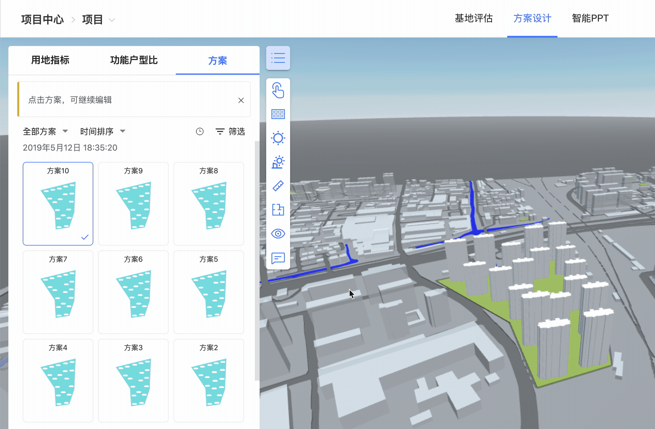
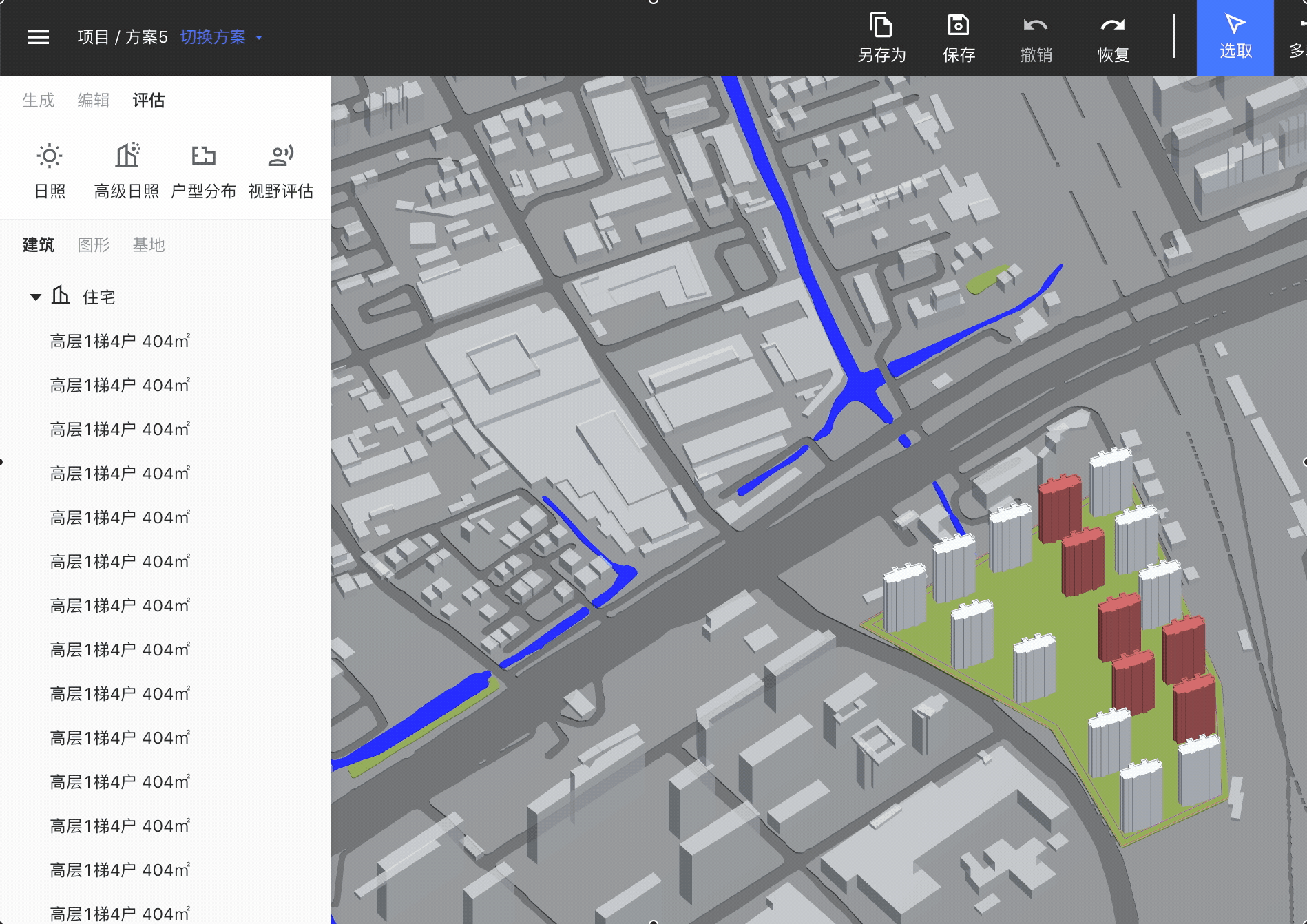
The primary project I am responsible for is the core product of the Kool series, called "Intelligent Planning" (KoolCAD). Unlike conventional architectural design software such as AutoCAD, KoolCAD stands out by integrating data with AI computation, offering more precise analysis and recommended outcomes. As the technology is still in its developmental stage, user involvement is necessary during usage. Through continuous experimentation, users can identify the most suitable combination of solutions.

V1.0

V2.0
The product framework was not well-established during the initial stages, directly impacting user experience and team development efficiency. For users, the usage process was lengthy and cumbersome, requiring multiple steps, constant switching and confirmation due to deep hierarchical structures. Additionally, the inability to quickly access or interrupt the process significantly hampered efficiency. From a team perspective, the lack of clarity in the hierarchical structure and relationships between functions led to redundant design work, such as repeatedly integrating the same drawing tool into different features. This resulted in overall development inefficiency and diminished product reusability.

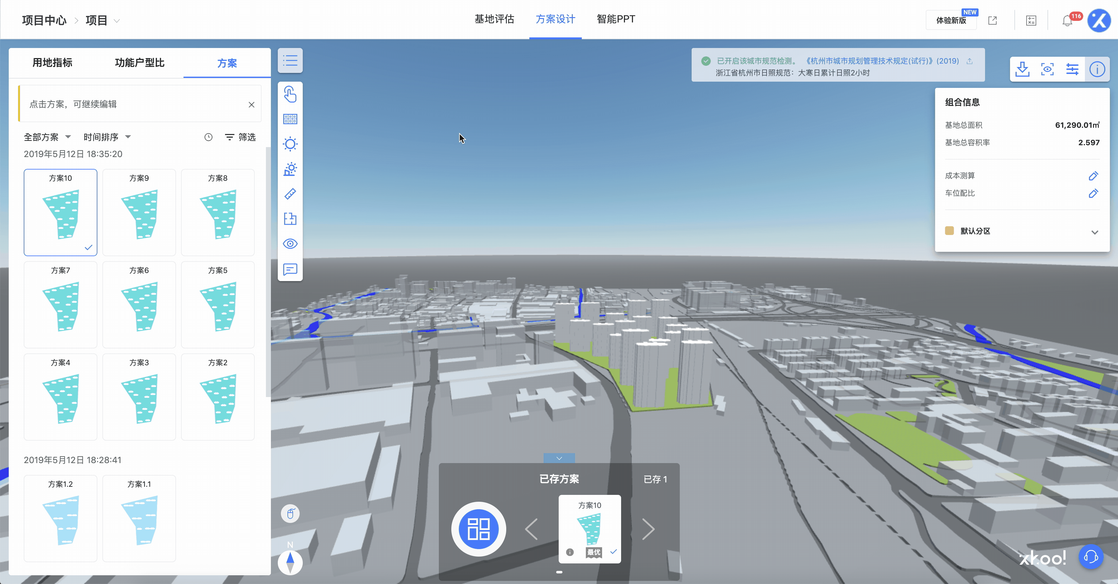
The operational process of V1.0 was relatively lengthy and intricate, with scattered and abundant information, significantly impacting usability efficiency.

Design Process

Solution
How to get there?
The most significant challenge I encountered throughout the project was how to enhance user efficiency during usage, effectively assist the team in project advancement, and simultaneously reshape our product experience. Therefore, prior to project initiation, it was crucial to comprehend the entire scope of the issues, analyze and categorize them, and establish clear design principles. Additionally, considering how to translate these principles into practical usage scenarios was essential. This approach aided me in making informed decisions by providing heightened visibility into the project's objectives.
Step 1. Establishing the Framework
From Components to Functional Modules and Scene Solutions
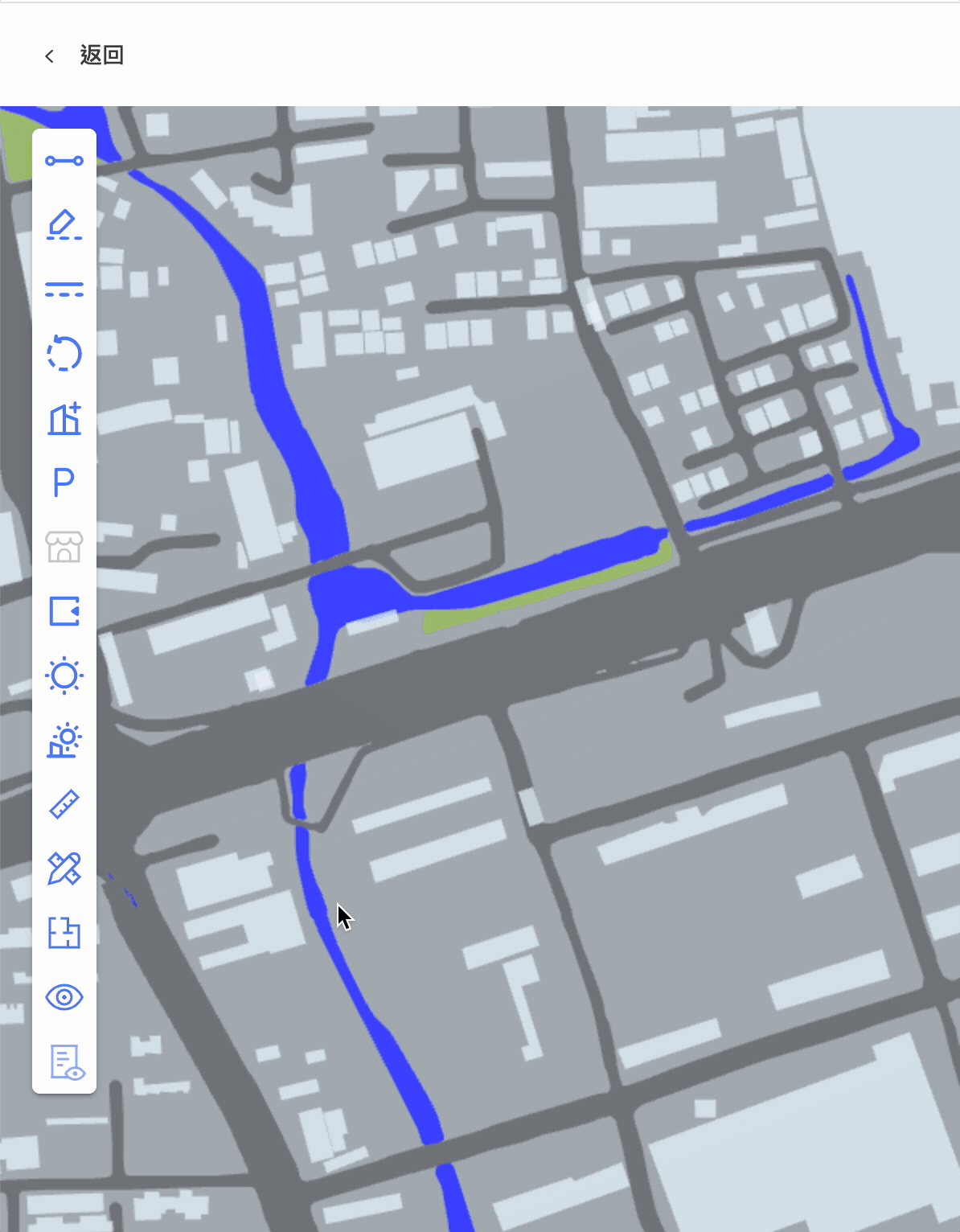
By establishing a new framework, I systematized functional modules, processes, and information. Simplifying the overall structure enabled the product to become more lightweight and user-friendly, reducing cognitive load for users during usage. I broke down and reconfigured functionalities to create new combinations, isolating commonly used drawing tools and integrating them alongside the main features. This approach introduced greater flexibility and convenience in operations.


Before
After
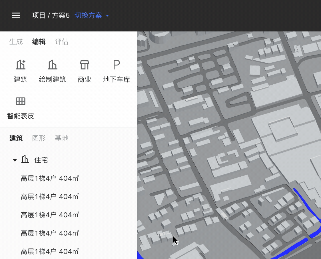
The most significant change was introduced in V2.0, where information content obtained a fixed position and consistent operational logic. The primary functionalities were organized as secondary panels expanding from the left-hand side. The uniformity in operational logic substantially reduced user learning curves while simultaneously enhancing usability efficiency.
V1.0
V2.0
All major functionalities were optimized to be achievable within a maximum of three streamlined process pages, as opposed to the previous 2-5 separate pages.
V1.0
V2.0

Product Framework & Function Types
Summarizing and categorizing modules, I've classified them into four primary types based on their interaction behaviors: Data Intelligence, Data Analysis, Data Visualization, and Tool-based functionalities. This approach ensures a clearer and more consistent operational logic within the product.
Core Objective
Aiding users in boosting work efficiency, facilitating more effective internal team development, and concurrently reshaping a consistent product experience.
Function Types


The global layout is organized to allocate different types of content to distinct areas: top functional zone, primary functional zone, attribute zone, and bottom functional zone. This approach enables the system to be scalable for sustainable expansion and continuous optimization in the future.
Layout Framework
Secondary
Primary
Step 2 Establishing System
Design Guidelines and Principles
Standardization and unification bring convenience to users, reduce communication barriers within internal teams, and consequently enhance work efficiency and collaboration. To elevate design standards comprehensively, a meticulous investigation was conducted prior to commencing the project, focusing on architectural software, SaaS platforms, and the screen resolution (1920px) commonly used by the target audience. Detailed usage principles were established for components, and all fine-grained styles were reconfigured.
A grid-based layout was introduced to provide more logical page arrangements and improved adaptability. Component spacing and sizes were set with a minimum unit of 4px and multiples of 2, allowing for a more organized arrangement of elements.

Continuously Collaborating With High Efficiency
Adhering to standards may entail a learning curve. To facilitate practical implementation, I've prepared a readily available component library. This library allows for adjusting designs based on specific page scenarios or starting from scratch. Utilizing components and modules, users can embark on new product designs with ease, significantly lowering the learning curve and achieving efficiency improvements.

Design Guidelines & Components
When creating components, I considered various usage scenarios based on different functionalities. Elements were placed within "blocks" to construct corresponding functional modules. This approach allows for swift drag-and-drop combination of components to create pages in accordance with specific requirements for each scenario.
Core Objective
The "drag-and-drop" component library allows users to adjust designs based on specific scenarios or create new product designs from scratch using components and modules.
Component Framework (Block)

Constructed from components, commonly used modules such as layers, parameters, charts, cards, and tables are combined based on product features and functional scenarios.
Modules

The combined results from the component framework are then categorized into five types based on content composition and hierarchy: Title, Tab, Filter, Selection Operations, and Main Content. Main Content is mandatory, while the others are optional, enabling quick access to the desired combinations.
Combination of Components


A Unified Product Experience
To ensure a consistent product experience, I've also standardized and optimized key functionalities and general-use features. For instance, the overarching operational logic for major functions lies within secondary panels expanded from the left-hand side. There's a global exit mechanism (Esc) for transitioning between different levels, differentiation between general selection and usage within major functions, establishment of relationships between drawing/editing tools and major functions, introduction of automatic correction and range prompting in numeric input fields to mitigate obstacles caused by erroneous actions, fine-tuned details including interconnectivity between layers, objects, and right-click menus, among other refinements.

Drawing Process & Input States
Result Validation
Within approximately one month, we conducted 20 rounds of small and rapid iterations on the product framework and components. We swiftly tested new iterations as they emerged. Rigorous evaluations were carried out to ensure optimal user experiences across various screen sizes, confirming that functions and the new framework were effectively adaptable. After completing comprehensive process streamlining and feature optimization, the product underwent six rounds of usability testing and A/B version validation.
After five months of creation, refinement, testing, and integration, the final V2.0 product upgrade was successfully launched. This practical journey has been a tremendous learning experience, equipping me with insights into the nuances required when establishing a design system and upgrading a product. The challenges encountered during this journey have contributed significantly to my personal growth.